Case study: Sky Lifts App
Creating a better digital experience for customers.
Overview
When I joined the company there was a slow decrease in the online bookings and a rising level of drop off users during the booking presses.
Task
Find out the reasons as to why the conversion rate was decreasing and make the overall website and booking presses a better experience for the user.
Research.
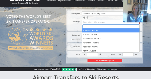
I started by going through the website, testing its responsiveness on different platforms (desktop, mobile) and seeing the user journey.
I did extensive research on what the company’s competitors were doing. I conducted interviews with the company’s stakeholders, managers and users from all relevant departments.

I designed personas of our most common users based on the analysis the marketing team had done thus making a strong visual representation of our users.
Usability testing.
I conducted usability tests with existing users and with our target audience. I noted the pain points our users were having and what their frustrations are.
Define.
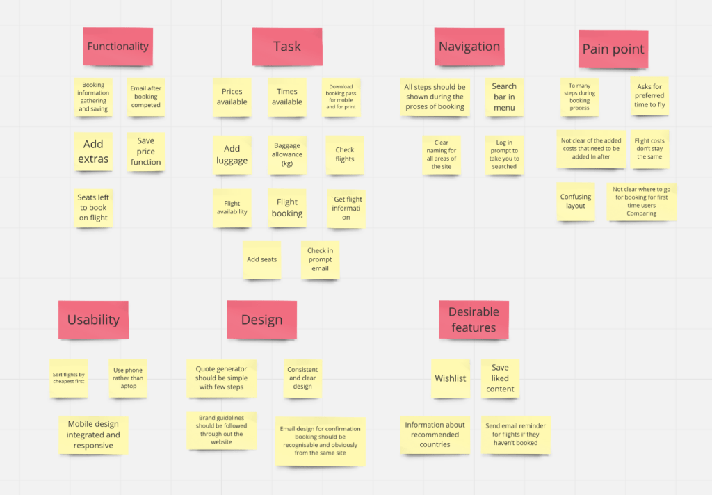
Affinity diagram
An affinity diagram is the best way to sort out the large number of ideas and brainstorming sessions.
We collaborated and brainstormed ideas using an affinity diagram and open card sorting we gathered a lot of information on what we need to include on the website, ideas on how to create/design the website and more importantly we all get on the same page for our course of action.
Design.
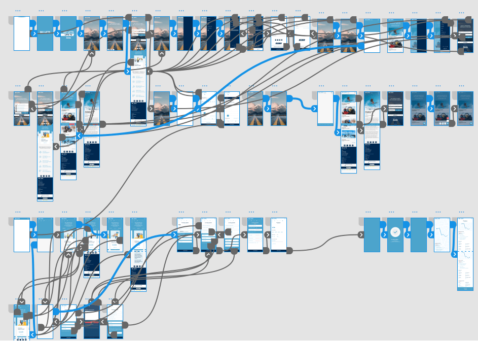
With the research/ information I had gathered I was ready to start making the high level flow of the user and wireframes combating the problem our websites were having.
The wireframes / design for the website I created was a much simpler and straight forward path through the booking process, this was a major pan point for users with a lot of needless questions and options for edge case users.
Streamlining the booking process and making a stepped process with fewer questions on each step, this allowed the user to focus and made the users less confused in finding their way through it much quicker and easier.
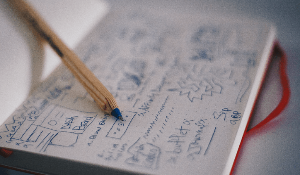
Low fidelity sketches
When I have correctly established the high level user flows for the design, I created the initial sketches and to understand how it would all fit together and doubly making sure that no time is waisted.
Initial designs.
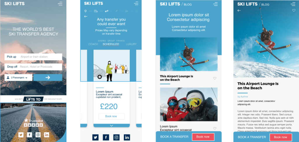
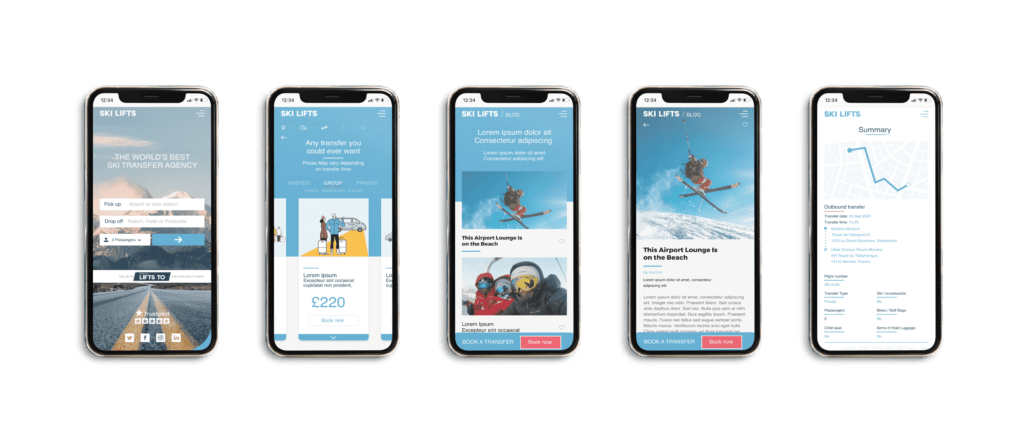
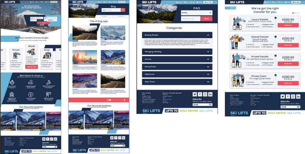
After the sketching stages of the wireframes I stared looking at the UI elements and what we wanted the website to look like. I created a few iterations of the websites UI that were in-keeping with the brand guidelines.
High fidelity prototype.
Once I created the wireframes and testing them out making sure the user journey was the best it could be I created and finalised the prototypes/designs in order to validate the designers on a broader scale of users via usability testing.
