Case study: TFS App
The Fragrance Shop app is a B2C mobile platform that offers a wide selection of fragrances to its users, along with exclusive benefits for paid members. The app’s primary goal is to attract new users interested in purchasing fragrances, fostering their engagement with the fragrance community, converting them into frequent buyers and or paid members.
Paid members enjoy an enhanced app experience, gaining access to exclusive perks such as instant 20%-25% discount voucher codes, scannable QR codes for use online or in-store, and free sample selection. These features are designed to provide a seamless and rewarding shopping experience.
Brief Overview.
The current app’s information architecture is outdated and confusing, making it challenging for users to navigate and reducing their likelihood of returning to the app.
The app prominently displays multiple pricing options for products, highlighting membership benefits. However, it assumes users are already familiar with the membership program and its offerings. Currently, there is no onboarding process for new users or easily accessible visual references for those interested in learning more about the membership.
The Goal.
Our objective was to enhance the user experience by streamlining the user flow and creating a more visually appealing design that will attract and convert more users.
The Fragrance Shop is redefining its app experience by transitioning from a purely transactional approach to a hybrid model that combines transactions with a strong focus on membership. This strategy emphasizes the brand’s unique selling points: MyTFS, Scent Addict, Fragrance Match, Social, and Every Human. Our vision is to create a best-in-class app that serves as the central hub for these USPs, offering a highly personalized experience to drive deeper engagement and customer loyalty.
The app will deliver tailored experiences based on customer profiles and their interaction with our USPs. For instance, non-members will experience a simplified homepage layout, while MyTFS members will enjoy an enhanced, personalized interface that highlights their membership details, order history, and exclusive features like “Order Again” widgets.
Building on the functionality of our mobile website, the app will reimagine these features to align with app-specific user experience standards. It will offer seamless navigation, faster interactions, and a visually engaging design optimized to elevate the customer journey.
By prioritizing membership, we aim to set a new standard in the digital fragrance space, delivering a platform that exceeds customer expectations and reinforces The Fragrance Shop’s position as a leader in innovative and premium digital experiences.
My Role.
As the Product Designer and Senior UX/UI Designer for this project, I took full ownership of the app from concept to delivery. My responsibilities encompassed user research, wireframing, prototyping, usability testing, iterative design improvements, and close collaboration with the development team.
Competitor Benchmarking.
To redefine The Fragrance Shop’s app experience, it’s crucial to analyse and benchmark competitors within the fragrance and beauty retail industry.
This includes evaluating their app features, user experience, membership strategies, personalization efforts, and unique value propositions.
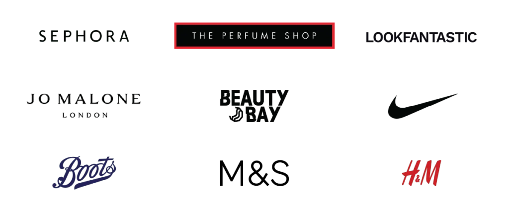
Sephora
Positioning: Beauty retail leader with a strong focus on product discovery, loyalty, and personalisation.
Key Features:
- Loyalty Program Integration: “Beauty Insider” program seamlessly integrated into the app, offering personalised recommendations, tier-based rewards, and exclusive perks.
- Personalization: Tailored product recommendations based on purchase history and preferences.
- Virtual Try-On: Augmented Reality (AR) technology allowing users to try makeup and fragrances virtually.
- Community: Built-in social engagement through user reviews, ratings, and Q&A forums.
Strengths:
- Highly intuitive and visually engaging app interface.
- Strong emphasis on education and exploration through video tutorials, masterclasses, and interactive content.
- Seamless omnichannel experience (e.g., syncing of in-store and online purchases).
Boots
Positioning: Broad retailer offering beauty, skincare, and fragrance with a focus on convenience.
Key Features:
- Loyalty Program: Integration of the popular “Advantage Card” program with in-app points tracking and exclusive offers.
- Fragrance Discovery Tools: Seasonal fragrance recommendations and gift guides.
- Multi-Category Shopping: Ability to shop across categories, including beauty and healthcare, in one app.
Strengths:
- Convenient, all-in-one shopping experience for beauty, fragrance, and lifestyle products.
- Strong focus on rewards and repeat purchases.
The Perfume Shop
Positioning: Direct competitor with a strong focus on fragrance discovery and gifting.
Key Features:
- Membership Program: VIP Rewards program with points-based discounts and exclusive access to promotions.
- Gifting Experience: Enhanced gifting options, including wrapping services and gift sets.
- Price Match Promise: A strong emphasis on affordability and price transparency.
- Mobile Features: Streamlined navigation for fragrance categories (e.g., new launches, bestsellers, seasonal picks).
Strengths:
- Strong promotional campaigns, including flash sales and personalised discounts for VIP members.
- Gift-oriented tools and services.
Jo Malone London
Positioning: Luxury fragrance brand with an emphasis on exclusivity and storytelling.
Key Features:
- Personalisation: Fragrance profiling quiz to match users with scents based on preferences and moods.
- Luxury Experience: Enhanced gifting options, including wrapping services and gift sets.
- Price Match Promise: Exclusive access to seasonal collections and limited editions through the app.
- Customer Care: High-touch support integrated into the app, offering consultations and personalised advice.
- Omnichannel: Strong alignment between app, in-store, and online experiences.
Strengths:
- Sophisticated and minimalist app design that reflects the brand’s luxury ethos.
- Storytelling-driven approach that highlights the craftsmanship behind each product.
Key Takeaways
Personalization is Crucial: Most competitors focus on tailoring the app experience to individual users through loyalty programs, recommendation engines, and AR tools. TFS can expand on this by leveraging customer data for personalised content, homepages, and offers.
Seamless Navigation and Design: A clean, intuitive interface with fast load times and easy checkout is now a baseline expectation across the industry.
Innovation in Fragrance Discovery: Virtual scent matching, curated discovery tools, and subscription services like Scent Addict can differentiate TFS.
Membership-First Strategy: Building a robust, feature-rich membership program (e.g., MyTFS) that rewards loyalty and engagement can create a competitive edge.
Omnichannel Integration: Ensuring a seamless experience across app, web, and in-store touchpoints will help retain and grow the customer base.
Pain Points

Key Research Takeaways
Overall Design & User Experience
- Outdated and unbalanced layout with poor hierarchy.
- Generic homepage lacks incentives for users to prefer the app over the website.
- Hero banners appear misaligned and not full width.
- Excessive space used for the “Stories” section without much user value.
Product & Membership Display Issues
- Product cards contain excessive text, potentially confusing first-time users.
- Membership price placement and explanation need improvement.
- Membership perks are unclear, and design is off-brand.
- Registration for new users is not prominent enough.
- Incorrect membership benefit information in pop-ups.
Store Availability & Map Functionality
- Store availability pop-up is unbalanced, with poor usability.
- Locations are only clickable on the map, making navigation difficult.
- No clear connection between map locations and store names.
- No option to send directions to external maps.
Brand & Sub-Brand Pages
- Brand pages are more visually engaging than the homepage.
- Large imagery limits product visibility.
- Brand video placement could be improved.
- “About Us” section looks like a footer and is too text-heavy.
- Sub-brand pages mirror product listing pages but lack filtering options.
Scent Addict Visibility
- Hidden within banners and search; needs better accessibility or reconsideration.
- Should be more distinct from MyTFS with its own brand identity.
- Lacks clear explanations of what it offers and how it differs from other services.
Search & Navigation Issues
- Basic search function lacks recommendations or autocomplete.
- “Show all” button appears but is non-clickable, causing confusion.
- Search results show full product cards, leading to excessive scrolling.
- Category pages lack hierarchy and visual appeal.
Filtering & Sorting Issues
- No clear indication of applied filters, making them difficult to manage.
- Users are forced to reset filters rather than adjust them.
- Too many sorting options—should prioritise commonly used filters.
User Journey
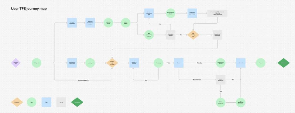
User Flow
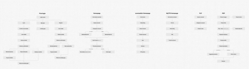
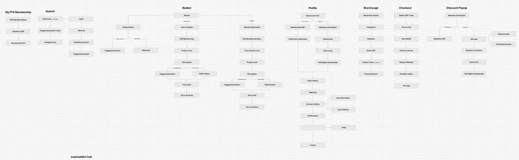
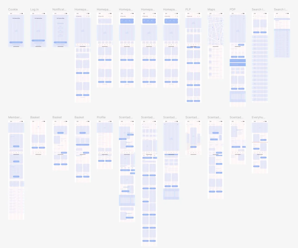
Wireframes
First App Load
Creating an account and becoming a member.
For this high-fidelity prototype design, I crafted a premium onboarding experience that appears exclusively on the user’s first app launch. The goal was to create a sleek, modern, and luxurious feel that aligns with the brand’s new direction.
To achieve this, I designed a stepped onboarding flow with a consistent video background, ensuring a visually engaging and seamless transition between steps. This approach enhances the experience without making the journey feel overwhelming or task-heavy, striking the right balance between immersion and efficiency.
Continue as guest.
This prototype demonstrates the alternative journey a user would follow if they chose to continue as a guest, without signing up or logging in. The flow is designed to provide a streamlined and efficient experience, ensuring that even non-registered users can easily navigate the app and complete their purchase.
Shadow Hints
To improve the onboarding experience for members, I introduced shadow hints that guide users through their exclusive features upon their first login. This subtle yet effective approach ensures that members immediately understand the benefits available to them. The hints provide contextual explanations without disrupting the experience, helping users seamlessly navigate and engage with their membership perks.
Homepage
Revamping the Member Homepage for a premium experience.
The redesigned member homepage offers a cleaner, more visually appealing experience, featuring larger imagery and dynamic hero banners that now support brand videos—allowing brands to showcase new products effectively and like no other competitor.
From a user-first perspective, I streamlined the layout by removing clutter and bringing key sections closer together for better accessibility. Members benefit from exclusive features not available on the non-member homepage, including:
- Quick access to membership vouchers and discount codes.
- Personalized homepage elements that highlight user-specific perks.
- Savings tracker, displaying how much they’ve saved with their membership.
- Order Again section for easy re-purchases.
These sections dynamically update based on the user’s engagement and benefits, ensuring a tailored, intuitive experience that enhances membership value.
Homepage for Non-Members.
While non-members don’t have access to the exclusive features available to members, they still benefit from a cleaner, more visually engaging experience. The redesigned layout is tailored to their needs, ensuring a streamlined journey that makes product discovery and navigation effortless. By prioritizing clarity and ease of use, this design enhances the overall user experience while subtly encouraging membership sign-ups.
Store Locator
The redesigned map offers a more intuitive and accessible experience, with a refined layout that provides a clearer overview of store locations. By repositioning the access button to a prominent, premium placement, users can quickly navigate to the feature. Additionally, the integration of geolocation enables seamless discovery of the nearest and most convenient store or pickup location, enhancing both usability and efficiency.
Navigation
The updated navigation features a more intuitive search experience, now including autocomplete suggestions, shop all function and product suggestions recommendations. Users can seamlessly browse through full categories and subcategories, while also being presented with four key highlighted products. This streamlined approach improves product discovery and enhances the overall browsing experience.
Membership
Membership page for Non-members.
The most prominent button in the centre of the bottom navigation bar now directs users to a redesigned and enhanced membership page. For non-members, this page has been optimised to streamline the onboarding process, clearly showcasing the exclusive perks and benefits of joining. The improved layout ensures users can quickly understand the value of membership, encouraging engagement and sign-ups.
Membership page for Members.
Once a user becomes a member, the membership onboarding page transforms into the Enhanced Members Hub, unlocking a suite of exclusive features designed to add value and personalisation.
Members gain access to:
- Exclusive offers, discount vouchers, and free samples.
- Personalised brand offers based on their favourite selections.
- A gifting reminder tool to set calendar alerts for special occasions.
- A savings tracker showing total money saved through membership.
- A membership overview for quick access to benefits and perks.
This tailored experience ensures that members fully benefit from their subscription, fostering engagement and long-term loyalty.
Basket
The empty basket page has been redesigned to enhance usability and drive conversions. Now, instead of a blank screen, users are presented with their previously viewed and favorited products, making it easy to quickly add items to their basket. This streamlined approach improves the shopping experience by providing relevant product suggestions and encouraging seamless purchases.
Basket for Members.
For members with items in their basket, a new voucher toggle allows them to easily apply their discounts to the entire order with a simple on/off switch. Additionally, other exclusive member perks have been integrated directly into the basket, including a free sample selector, ensuring a seamless and rewarding checkout experience. This update enhances usability while reinforcing the value of membership benefits.
Profile
Profile for Non-members.
The profile page has been redesigned to offer a more visually appealing and engaging experience. A prominent top video creates a dynamic introduction, while clearly defined sections make it easier for users to navigate their information. Additionally, a membership onboarding prompt encourages non-members to explore the benefits of joining, enhancing both usability and user engagement.
Profile for Members.
For members, the profile page includes additional features that provide a clear overview of their perks. This section highlights a range of benefits, giving users quick access to their exclusive offers, discounts, and other membership-related features, ensuring they can easily track and make the most of their membership.
Product Listing Page
The Product Listing Page has been completely overhauled with a user-centered design to improve product discovery and decision-making. The page is now optimized to display multiple products and deliver key information quickly to users who are actively looking to purchase.
Key enhancements include:
- A streamlined filtering system, making it easier for users to narrow down their options.
- A new quick buy option that allows users to select the product, choose a size, and add it directly to their basket without additional steps.
- The addition of promotional banners for brands to showcase their latest offers or campaigns.
These updates aim to create a more intuitive and efficient shopping experience, increasing user satisfaction and conversion rates.
Product Display Page
The Product Display Page (PDP) is one of the most crucial touch points in the shopping journey, providing users with all the essential details they need before making a purchase. While I refined the existing sections to be more visually appealing and modern, the most impactful improvements are the user-centric additions based on insights from user research.
Key enhancements include:
- “Gifts” and “Try It First” pop-ups – providing a clear overview of available add-ons for each product.
- A streamlined gifting options pop-up, which now consolidates:
- Gift wrapping services
- Engraving options
- Gift bag selections
- Gift card choices
Users can effortlessly select one or multiple gifting options as add-ons.
- Fragrance intensity section, which displays the scent strength and suggests alternative options for the same product to help users find their perfect match.
- Fragrance Preview Pop-Up provides users with a detailed breakdown of the different fragrance notes that make up the scent. This feature helps users better understand the composition of a fragrance before purchasing, offering a more informed and engaging shopping experience.
By taking a user-first approach, this redesigned PDP makes it significantly easier for customers to browse, compare, and customize their purchases—ultimately enhancing their shopping experience and increasing conversions.
Brand pages
Brand pages serve as dedicated spaces where partner brands can showcase their best and newest products, catering to users who prefer to shop by brand. Given their importance, I redesigned these pages to offer a more engaging and immersive experience beyond a standard product listing.
Key enhancements include:
- A layout that reflects the brand’s unique personality, creating a more authentic and premium feel.
- Curated sections highlighting the brand’s story, signature collections, and exclusive launches.
- A seamless blend of storytelling and product discovery, ensuring users feel connected and validated in their choice.
By transforming these pages into branded experiences, users can explore everything a brand has to offer in a way that feels engaging, immersive, and tailored to their preferences.
Payment Confirmation Screen
The Product Confirmation Screen provides users with clear validation and reassurance that their purchase has been successfully completed. To enhance the experience, I designed:
- An animated confirmation screen to create a sense of satisfaction and excitement.
- A thank-you message to show appreciation for the user’s purchase.
- A detailed receipt summary, ensuring transparency and verification of the order.
This final step in the journey reinforces trust, confidence, and a premium shopping experience for the user.